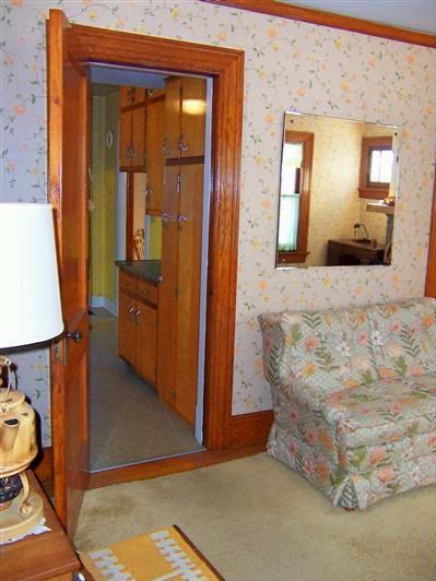
This was what the living room looked like when we first walked in, including the "back hall" of the kitchen. This wallpaper must have been the envy of the neighborhood in the 1950s (it was meticulously, perfectly applied) but by today's standards, it is borderline grotesque. And look at the love seat: it's almost camouflaged!
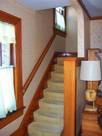
This is the staircase just to the left of the view above. (Note the crazy tea kettle lamp!) This wallpaper (a different pattern from that in the rest of the living room decorates the staircase and the upstairs hall) seems extremely stuck.
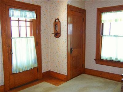
This is the front door, which I love. It has so many different locks, two of which are quite antique and quite unstoppable. It has an old 1920s automatic lock that locks on its own each time the door closes. Note to self: never go out to get the mail in your bare feet and jammies!
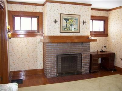
This is our fireplace and gorgeous windows, on the other side of the living room, near the dining room doors. The fireplace, it turns out, was rarely used as a wood burning fireplace, but never should have been used at all, as its design will not accommodate the high heat. We are thinking ventless insert.
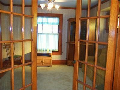
Beautiful french doors open into our dining room. I love its openness. One thing the realtor did not advertise: a stunning stained glass window of grapes and vines was built into the bump-out, which is obscured here by the door on the right. (I'll post pictures of it later.) It did not convey. I assume it was crafted by a member of the family, or at least was well-loved by the family, (who had owned the home since 1948) because they took it with them when we closed. They replaced it with an ugly, vinyl-framed factory-made leaded glass insert... but again that is a story for another post!
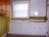
This is our kitchen (so tiny) but thankfully it comes with an adjoining breakfast nook that is a generous seven feet by seven feet. This wallpaper was a NIGHTMARE. It was thick and vinyl coated, so it was easy to remove. However it was greasy from years in the kitchen and left your hands feeling sticky and filthy. Eww. Not to mention it was a hideous pea-green village scene. Yuck! Anyway, the cabinets are three different kinds, two different colors (wood and white) and three different kinds of hardware. But I love the rounded shelves near the window so I can't bear to part with them. I foresee a lot of sanding and painting in our future! Aside from its daintiness, our kitchen is layed out in a very odd fashion. Once we put the stove in (the only place the stove can go given the outline on the linoleum and the gas line access) We won't be able to open the entire set of drawers on the left side of this picture. And even though we purchased a 1950s General Electric Spacemaker refrigerator, given the cabinet placement on the other side of the kitchen, even this tiny fridge won't fit! The space left for the fridge, (again, the only place to put it) is a little over 5 feet tall, which I only know because I barely fit under it, and I estimate it is only about 3 feet wide. Something will have to come out of that kitchen to accommodate it. That's all there is to it.
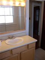
This is our bathroom. (Or rather our vanity.) I adore the little unpolished 1-inch porcelain hexagon tiles. But alas, their condition is too poor to salvage. Our lofty ambition is to replace the floor with similar tile and to put in a restored claw foot tub. I'll keep you posted on that one. Once you see the rest of the bathroom, you'll know just how ambitious our scheming really is!
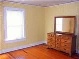
This will be our bedroom. This wallpaper peeled RIGHT off to expose a rather pretty robin's-egg-blue painted plaster. There are little groove lines in places from a craftsman's trowel. I love these little imperfections too much to smooth them over! I really would like to keep them. But we'll see what boyfriend says, since it's his room, too!
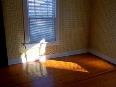
And a darker, different-angled version of that same bedroom.
Also in the floor plan but not pictured are two additional bedrooms, 5 closets, an attic (accessed by disappearing staircase), a full basement complete with 9" asbestos tile, a shuffleboard court, and two "coal rooms" under the porch. But this is as we saw it online- the third day it was on the market. It was love at first click.
No comments:
Post a Comment